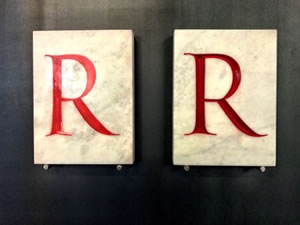
Sure, we all love type.
We love letters that we can relate to — whether handrawn, clean fonts, old-style work or hyper-modernist future fontography.
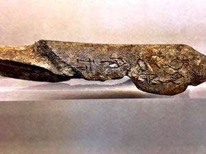
I go old, deep, dark, pre-Christian. Really old.
I like both.
Really old.
Moderately old.
Recent. Now. Future.
I go where the story is, and needs to be told.
But we forget about how it actually works —
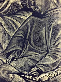
the alphabet is a mystery of markings that reach back thousands of years yet in the last 500 years, there has been a wide dispersal of how type is actually arranged, and that’s something we forget —
how it’s set as an array of characters.
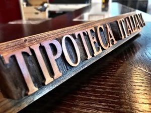
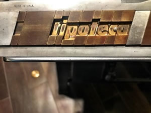
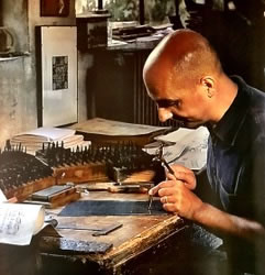
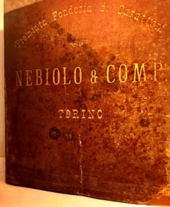
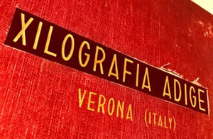
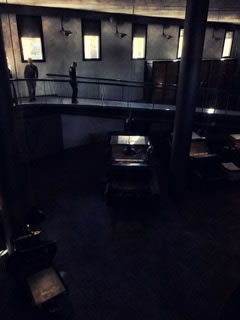
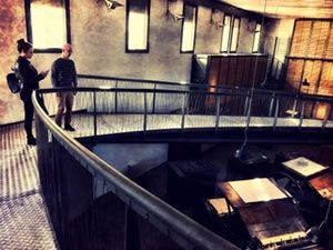
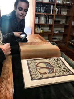
While I was with the ALUCrew, I took a tour of a type museum, that’s actually a museum of “printing,” how letterforms are arranged and printed to array meaning. The Museum?
Tipoteca.it:
Il Museo
della Stampa
e del Design
Tipografico
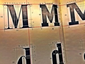
In our work, coincidentally aligned with a blog posting [one of many] on GIRVIN’s type design, as well as our typographical eblast disseminated to our friends and clients around the world, we design type by drawing it, pens, pencils, brushes — then we convert these renderings to a digital form and build on that towards key-strokable accessibility.
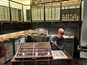
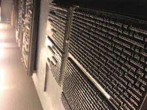
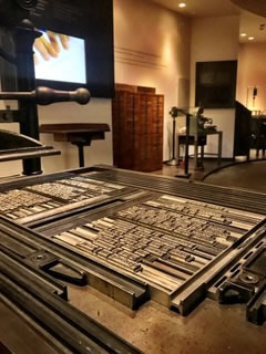
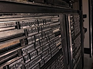
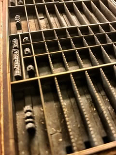
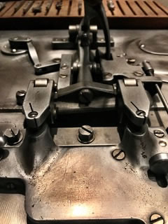
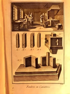
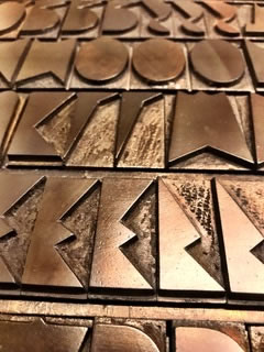
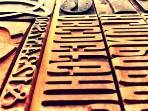
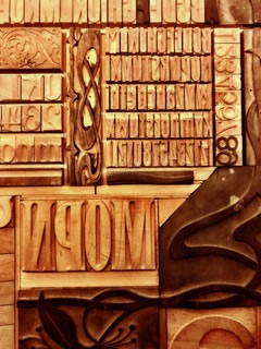
This museum plays to the history of letter press work — the technological evolution of the last 500+ years, then examines the way and the what of type design, the stamp work of creating hand-carved and punched lead types for impression, as well as the printed exemplars. The Museum is built as a foundation to type and printing, endowed by a visionary and grateful printer.
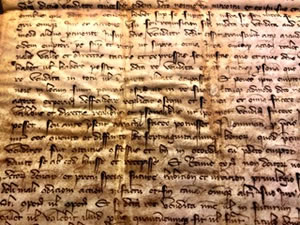
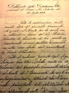
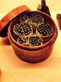
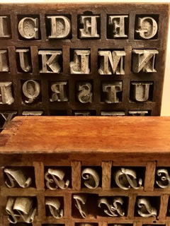
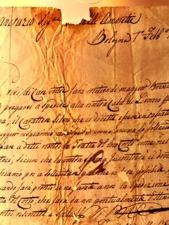
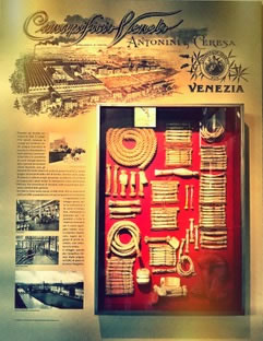
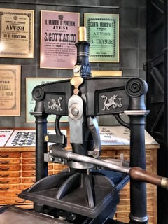
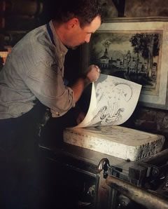
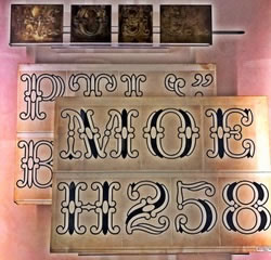
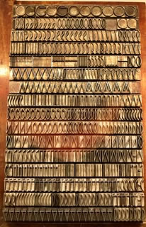
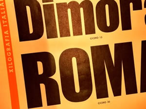
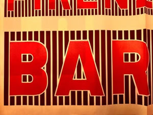
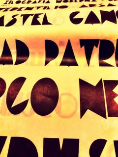
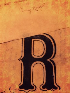
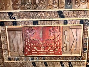
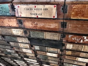
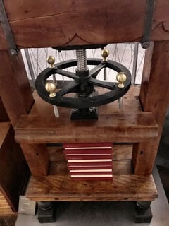
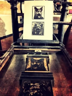
Here’s a tour in a collection of small images for your perusal. It’s quite an amazing collection — not only to the notion of type design, but as well, a collection of presses and types of printing, and folios of letter samples from some of the grand font houses of Italy.
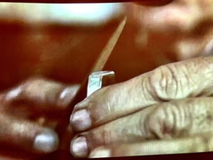
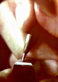
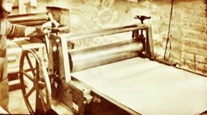
Anyone involved with the basics of design will recognize how this works — lead type, impressed once or repetitively into stock by a single punch of pressure, or rolled and repeatedly stamped for the creation of a multiplicity of documents.
As it was back then.
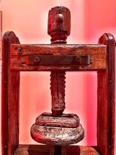
And as it was back then, later —
into the last century.
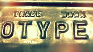
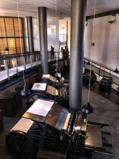
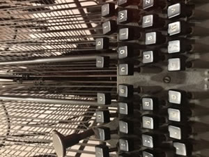
The LinoTypesetter.

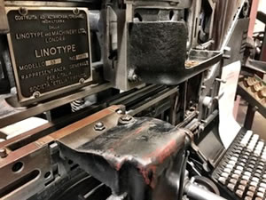
When I first started as a typophile, I worked on old-style press plate work and letterpress — and there are likely a couple here that will recognize a Vandercook. Others will get the general tenor of the press strategy — inking type set in a press set-up and impressing that reversed typography into paper.
Its feeling is unmistakable.
Questions about an image, pull it out, resend to me with a question: ask me?
Been there, done that.
One thing that is distinct to much of the work is the perfume of hot ink, linotype-cooked metal, sheared paper stocks.
Nothing like that, in contemporary press work.
This museum is a celebration of an entirely ingenious technology, that in its iterations and variations over time, continued to push the limits of how quickly words and ideals could be cast as a set of letters, then printed.
For me, it took me to my beginnings and my Alphabet Odyssey in 1976: meeting with fine printers, type designers, stone cutters, glass and crystal engravers, sign painters, shop owners, and typographical artists in London, Oxford, Cambridge, Paris, and in studios in Switzerland, Austria, and the former U.S.S.R including Moscow and Tallinn.
All on a grant from the National Endowment for the Arts for:
$500.00.
And yes, the decimal point is correct.
Shoestring.
It was in this adventure, meeting live with masters like David Kindersley, Will & Sebastian Carter, Heather Child, Donald Jackson, Ann Hecle, Adrian Frutiger, Hermann Zapf, Gudrun Zapf von Hesse, Friedrich Neugebauer, Hans Halbey, Hans Schmitt, Karlgeorg Hoefer, Maxim Zhukov, Leonid Pronenko, Villu Toots — among others — that I laid the foundations
for who I am today.
For
lovers of
type design,
this
is
for
you.